2012 was quite a turbulent year in terms of technology, with the latest iteration of Windows being released, about half a billion patent cases involving Apple, and a surge in the “Startup Culture”. Now that the year is coming to an end, Didgeroo takes the opportunity to look towards the future by trying to understand what new goodies it will find a use for in 2013. As such, here are the most anticipated Web trends that Didgeroo expects to see in 2013
1. Skeuomorphism vs Authentically Digital
Recently, over the past year or so, two major software design trends have emerged and become very obvious. These are the Skeuomorphism and the Authentically Digital design language. Whilst neither are ergonomically named, their design choices are rather prominent in technology today, and are likely to bleed over into web design in the near future.
Skeuomorphism is the philosophy of likening a digital object or feature to a real-world counterpart, and is very prevalent in the Apple design ideal. Features such as a clock being shown as a large dial, calendars shown as leather bound books are all instances of skeuomorphism. Ultimately, skeuomorphism (so glad I won’t type that again) is the practice of introducing aesthetically pleasing, yet contextually out of place items into an environment where they are not needed, such as a physical clock-face being introduced where a digital clock suffices.
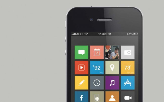
Authentically Digital design, however, is very much the opposite of the previous design philosophy. This design style involves the use of objects, features and colours that very much fit in with their surroundings. Microsofts’ latest OS, Windows 8, is a prime example of Authentically Digital design, with large , 2D block buttons, bright colours and a constant whir of motion. Authentically Digital design excels in its’ presentation in motion, and thus very much fits the continuing trend of mobile devices, whereby navigation in the digital space requires large amounts of real-world motion.
These 2 design languages have been very apparent in 2012, and it is likely that they shall continue picking up steam in 2013, and likely crossover into web design.

2. Parallax Scrolling
Parallax Scrolling is, in simple terms, the perceived position of an object when a persons perspective changes. To think that is the simple explanation. In web design, parallax scrolling is a fairly recent trend, with web technologies lagging behind other industries, such as gaming, where parallax scrolling has existed for a couple of decades.
In the web-design stance, parallax scrolling involves layering images that move independently from one another, to create an interesting effect when the user scrolls around a page. The end result is that you can create the illusion of 3D objects within a 2D plane. The potential for this new trend is enormous, with the possibility of you being able to view products in 3D without the need for a complex plugin. Parallax is bringing 3D in 2D technology to the masses of web designers and developers whom are most likely to innovate within their industries.
Here are some fantastic examples of parallax scrolling that we like :
3. WordPress 3.5
Elvin is here! Launched last week, the latest incarnation of WordPress, version 3.5 codenamed “Elvin”, will no doubt continue the blazing trail that WordPress has seen in recent years which has lead its dominance in the Open Source CMS market.
New features include:
Awesome new Media Manager
New default theme
Assorted administration and developer enhancements
A whole lot of tweaks and changes that are too many to list in a summary article.
Check out the full list of features here:
http://codex.wordpress.org/Version_3.5

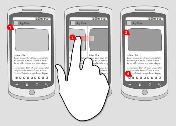
4. Responsive Web Design (RWD)
Whilst popular in 2012, the demand for responsive design will surely continue to grow in 2013 as more websites try to cater for mobile users.
With the surge in smartphone usage over the past 3 years, initially native apps were seen as the best way create content for small screens. This proved to be too time consuming and expensive. In recent time Apple has been rejecting apps that could simply be a web app.
Web apps are good in some situations, however they usually require a completely separate website to the desktop versions. This obviously becomes a nightmare to update and maintain.
Responsive design is the answer!
With Responsive Web Design (RWD), it is possible to adjust the measurements of your website so that they automatically scale to the size of the users’ screen or browser window. This means that the website will look great regardless of how it is viewed, whether on a mobile device, a tablet or a 27″ monitor.
Below are some examples of websites currently using some form of RWD.
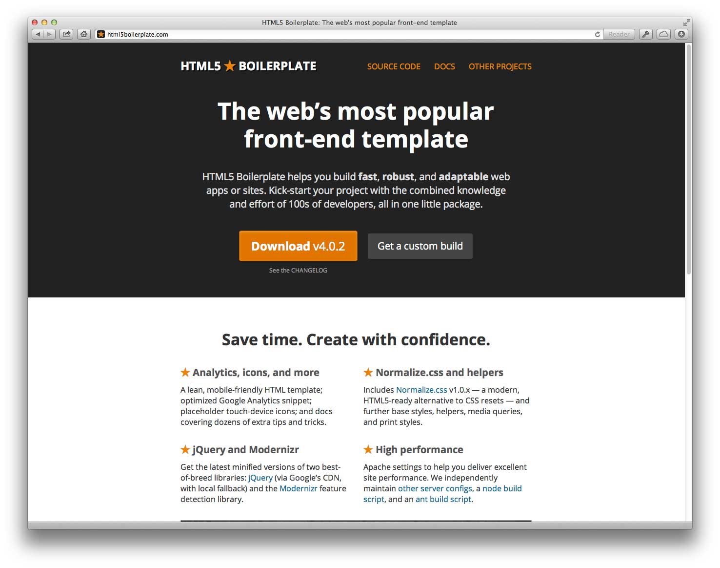
5. Front-end frameworks
Front-end frameworks offer a simpler way of setting up a website, or even multiple websites, all while maintaining a similar style.
Front-end frameworks are essentially a set of files and libraries, including CSS, HTML and Javascript, that are used to develop a website template that can be used on multiple projects.
These frameworks are slowly making headway in the web development world, and are likely to continue gaining popularity in 2013, especially with web-based applications and SaaS.
Below are some examples of current Front-end Frameworks:
6. RIP Horizontal Scrolling
Horizontal scrolling websites are nasty. The human brain is used to scrolling down, not across. The mouse wheel typically works on just one axis, so why arty creative folk have insisted over the years to have horizontal scrolling websites has always been a mystery to me.
With the rise in mobile devices, and the difficulty one has trying to scroll horizontally on them, the death of these weird horizontal websites is near. RIP horizontal scrolling, long live vertical scrolling websites. (Sentiments of Chris, Martin happens to like horizontal websites.)
2014 Predictions – HiDPI (retina) support
It’s not even 2013 and here we are making bold predictions for 2014! Maybe this one will happen sooner, but it’s still early days for Apple new Retina displays and other manufacturers are still to catch up.
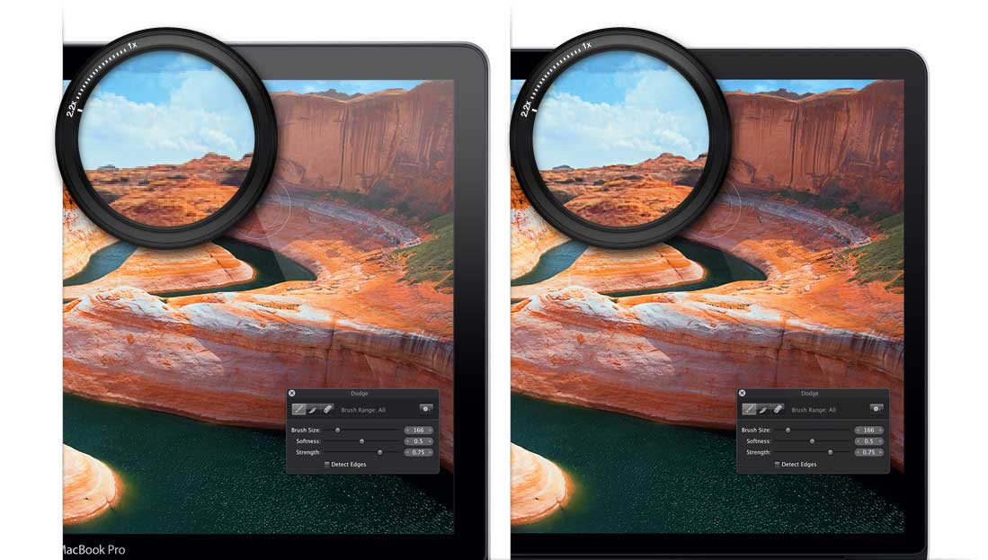
So what is HiDPI? Well traditionally, the web has been desiged arround 72dpi. This was the dpi limit of most CRT monitors. Print on the other hand is generally 300dpi. Well, all this changed earler this year when Apple released their new Retina iPads and Macbook Pro. These displays have an incredible 220dpi pixel densitiy!
For now, only Apple is producing HiDPI display, but no doubt once other manufactures start produceing them, everyone will be expecting their websites to be optimised for them.
Initially, we should see a demand for photography to be displayed at HiDPI when available. This should be pretty simple using some javascript, for example; http://retinajs.com/
For entire websites to support HiDPI, the situation is more complex. Read on if you’re interested: http://coding.smashingmagazine.com/2012/08/20/towards-retina-web/b/
So there you have it; the top web trends that Didgeroo is looking forward to (mostly) in 2013. We hope that you might consider Didgeroo when thinking about implementing these technologies. We love a challenge, and we want to get our teeth stuck into the future.

Didgeroos 2013 Web Trends
2012 was quite a turbulent year in terms of technology, with the latest iteration of Windows being released, about half a billion patent cases involving Apple, and a surge in the “Startup Culture”. Now that the year is coming to an end, Didgeroo takes the opportunity to look towards the future by trying to understand what new goodies it will find a use for in 2013. As such, here are the most anticipated Web trends that Didgeroo expects to see in 2013
1. Skeuomorphism vs Authentically Digital
Recently, over the past year or so, two major software design trends have emerged and become very obvious. These are the Skeuomorphism and the Authentically Digital design language. Whilst neither are ergonomically named, their design choices are rather prominent in technology today, and are likely to bleed over into web design in the near future.
Skeuomorphism is the philosophy of likening a digital object or feature to a real-world counterpart, and is very prevalent in the Apple design ideal. Features such as a clock being shown as a large dial, calendars shown as leather bound books are all instances of skeuomorphism. Ultimately, skeuomorphism (so glad I won’t type that again) is the practice of introducing aesthetically pleasing, yet contextually out of place items into an environment where they are not needed, such as a physical clock-face being introduced where a digital clock suffices.
Authentically Digital design, however, is very much the opposite of the previous design philosophy. This design style involves the use of objects, features and colours that very much fit in with their surroundings. Microsofts’ latest OS, Windows 8, is a prime example of Authentically Digital design, with large , 2D block buttons, bright colours and a constant whir of motion. Authentically Digital design excels in its’ presentation in motion, and thus very much fits the continuing trend of mobile devices, whereby navigation in the digital space requires large amounts of real-world motion.
These 2 design languages have been very apparent in 2012, and it is likely that they shall continue picking up steam in 2013, and likely crossover into web design.
2. Parallax Scrolling
Parallax Scrolling is, in simple terms, the perceived position of an object when a persons perspective changes. To think that is the simple explanation. In web design, parallax scrolling is a fairly recent trend, with web technologies lagging behind other industries, such as gaming, where parallax scrolling has existed for a couple of decades.
In the web-design stance, parallax scrolling involves layering images that move independently from one another, to create an interesting effect when the user scrolls around a page. The end result is that you can create the illusion of 3D objects within a 2D plane. The potential for this new trend is enormous, with the possibility of you being able to view products in 3D without the need for a complex plugin. Parallax is bringing 3D in 2D technology to the masses of web designers and developers whom are most likely to innovate within their industries.
Here are some fantastic examples of parallax scrolling that we like :
3. WordPress 3.5
Elvin is here! Launched last week, the latest incarnation of WordPress, version 3.5 codenamed “Elvin”, will no doubt continue the blazing trail that WordPress has seen in recent years which has lead its dominance in the Open Source CMS market.
New features include:
Awesome new Media Manager
New default theme
Assorted administration and developer enhancements
A whole lot of tweaks and changes that are too many to list in a summary article.
Check out the full list of features here:
http://codex.wordpress.org/Version_3.5
4. Responsive Web Design (RWD)
Whilst popular in 2012, the demand for responsive design will surely continue to grow in 2013 as more websites try to cater for mobile users.
With the surge in smartphone usage over the past 3 years, initially native apps were seen as the best way create content for small screens. This proved to be too time consuming and expensive. In recent time Apple has been rejecting apps that could simply be a web app.
Web apps are good in some situations, however they usually require a completely separate website to the desktop versions. This obviously becomes a nightmare to update and maintain.
Responsive design is the answer!
With Responsive Web Design (RWD), it is possible to adjust the measurements of your website so that they automatically scale to the size of the users’ screen or browser window. This means that the website will look great regardless of how it is viewed, whether on a mobile device, a tablet or a 27″ monitor.
Below are some examples of websites currently using some form of RWD.
5. Front-end frameworks
Front-end frameworks offer a simpler way of setting up a website, or even multiple websites, all while maintaining a similar style.
Front-end frameworks are essentially a set of files and libraries, including CSS, HTML and Javascript, that are used to develop a website template that can be used on multiple projects.
These frameworks are slowly making headway in the web development world, and are likely to continue gaining popularity in 2013, especially with web-based applications and SaaS.
Below are some examples of current Front-end Frameworks:
6. RIP Horizontal Scrolling
Horizontal scrolling websites are nasty. The human brain is used to scrolling down, not across. The mouse wheel typically works on just one axis, so why arty creative folk have insisted over the years to have horizontal scrolling websites has always been a mystery to me.
With the rise in mobile devices, and the difficulty one has trying to scroll horizontally on them, the death of these weird horizontal websites is near. RIP horizontal scrolling, long live vertical scrolling websites. (Sentiments of Chris, Martin happens to like horizontal websites.)
2014 Predictions – HiDPI (retina) support
It’s not even 2013 and here we are making bold predictions for 2014! Maybe this one will happen sooner, but it’s still early days for Apple new Retina displays and other manufacturers are still to catch up.
So what is HiDPI? Well traditionally, the web has been desiged arround 72dpi. This was the dpi limit of most CRT monitors. Print on the other hand is generally 300dpi. Well, all this changed earler this year when Apple released their new Retina iPads and Macbook Pro. These displays have an incredible 220dpi pixel densitiy!
For now, only Apple is producing HiDPI display, but no doubt once other manufactures start produceing them, everyone will be expecting their websites to be optimised for them.
Initially, we should see a demand for photography to be displayed at HiDPI when available. This should be pretty simple using some javascript, for example; http://retinajs.com/
For entire websites to support HiDPI, the situation is more complex. Read on if you’re interested: http://coding.smashingmagazine.com/2012/08/20/towards-retina-web/b/
So there you have it; the top web trends that Didgeroo is looking forward to (mostly) in 2013. We hope that you might consider Didgeroo when thinking about implementing these technologies. We love a challenge, and we want to get our teeth stuck into the future.
Tags: