
As part of our ongoing research into innovations and best practices, we have prepared the following recommendations for creative agencies working with Didgeroo.
Over the last 6-months or so the general trend for RWD has been heading towards a fully fluid layout. This is great for end users, kind of good for developers, but a bit of a nightmare for old school designers.
We have found many designer’s brains go into meltdown when they loose control of widows, orphans, cropping etc!
Therefore at this point I recommend the best approach is to use a mix of fixed and fluid. Fluid width for very small viewports (smartphones) and a series of fixed widths for everything else.
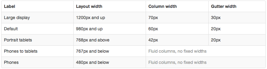
I think the best framework to handle this is to stick to the legacy version of Bootstrap – version 2. The breakpoints it uses are as follows:
I have created a set of PSD grids to help aid the design workflow:
Download Zip
The widest three PSD’s (768, 980, 1200) should be considered fixed width i.e. as the browser window width increases, all objects remain the same size and proportion while additional padding is added to either side of the page. Each of these grids have 12 columns as per the table above. If everything you design sticks within these guides that makes our job easier. You can of course span content across multiple columns in the grid (including the gutters). Just try to avoid content starting or stopping mid-column. That said, exceptions can be made if necessary.
The smallest two PSD’s should both be considered fluid and have just a single column each. They do not have a gutter so you may wish to add some padding to them. On the website, content will expand and contract on these to fill the width of the screen (i.e. fluid width). This does not mean font sizes will change. However images can be set to scale so they remain full width without cropping or distorting.
The following page is a good example of the grid in action https://getbootstrap.com/2.3.2/examples/hero.html
If you want to reduce your design workload, then the minimum requirement is just 3 templates – 767-fluid (smartphones) 768-fixed (tablets) and 980-fixed (desktops). Personally I would go for all the 1200 one as well. The 480 media query is generally used to perform tweaks for very narrow viewports.
Finally, here’s a nice listing of RWD examples to inspire you https://www.mobify.com/blog/70-stunning-responsive-sites-for-your-inspiration/

Responsive Web Design Guidelines for Designers
As part of our ongoing research into innovations and best practices, we have prepared the following recommendations for creative agencies working with Didgeroo.
Over the last 6-months or so the general trend for RWD has been heading towards a fully fluid layout. This is great for end users, kind of good for developers, but a bit of a nightmare for old school designers.
We have found many designer’s brains go into meltdown when they loose control of widows, orphans, cropping etc!
Therefore at this point I recommend the best approach is to use a mix of fixed and fluid. Fluid width for very small viewports (smartphones) and a series of fixed widths for everything else.
I think the best framework to handle this is to stick to the legacy version of Bootstrap – version 2. The breakpoints it uses are as follows:
I have created a set of PSD grids to help aid the design workflow:
Download Zip
The widest three PSD’s (768, 980, 1200) should be considered fixed width i.e. as the browser window width increases, all objects remain the same size and proportion while additional padding is added to either side of the page. Each of these grids have 12 columns as per the table above. If everything you design sticks within these guides that makes our job easier. You can of course span content across multiple columns in the grid (including the gutters). Just try to avoid content starting or stopping mid-column. That said, exceptions can be made if necessary.
The smallest two PSD’s should both be considered fluid and have just a single column each. They do not have a gutter so you may wish to add some padding to them. On the website, content will expand and contract on these to fill the width of the screen (i.e. fluid width). This does not mean font sizes will change. However images can be set to scale so they remain full width without cropping or distorting.
The following page is a good example of the grid in action https://getbootstrap.com/2.3.2/examples/hero.html
If you want to reduce your design workload, then the minimum requirement is just 3 templates – 767-fluid (smartphones) 768-fixed (tablets) and 980-fixed (desktops). Personally I would go for all the 1200 one as well. The 480 media query is generally used to perform tweaks for very narrow viewports.
Finally, here’s a nice listing of RWD examples to inspire you https://www.mobify.com/blog/70-stunning-responsive-sites-for-your-inspiration/
Tags: